UX case study

New

E-shop for
Mandlárna UX

+75%

Conversion

6

E-points weekly

+3658

New customers

Project kick off

Mandlárna had an old web site that did not reflect their needs for sale of their product and their future vision of how to do business online.

After the client was on the board with a price proposal where part of that proposal was UX research and design, the fun could start.
.

GOALS & EXPECTATIONS

From the initial stakeholder workshop we came up with better understanding of clients needs, goals and expectations for the new web.

GOAL 1

To sell

Client wanted to be able to sell online more, faster and easier with great tracking

GOAL 2

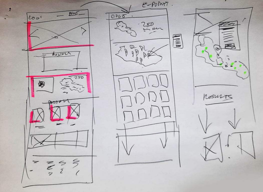
E-point map

To have interactive map with all new places where customers can buy the product in person (country wide)

GOAL 3

Combine products

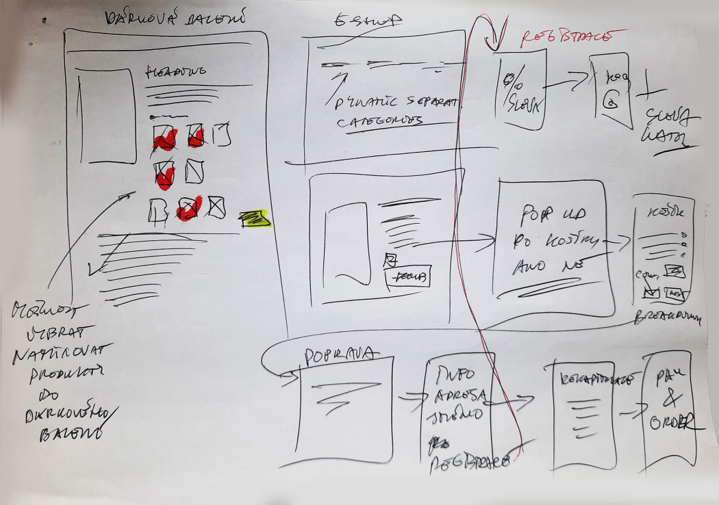
Customers should have the option to build a gift package combining other products.

EXPECTATION

Better bookkeeping

Also client wanted to have integration for better bookkeeping management

RESEARCH

All there is to know

01.

Analytical data

We mapped the old web site and looked into analytic data to see where the pain points for the user were.

02.

Customer surveys

Through customer surveys we got valuable feedback on what is expected from the new site and all sorts of suggestions.

03.

Usability testing

We clarified all collected words and verbal feedback and ran usability testing (10 users) of the old web to confirm all previous findings.

03.

Customer support

Very great feedback was obtained through 2 call ladies who managed sales and deal on daily bases with, at that time, not happy customers.

03.

Competitive analysis 

Who is the competitor either direct or indirect that is selling this amazing almond drink on other websites + other beverages sites was really eye opening. 
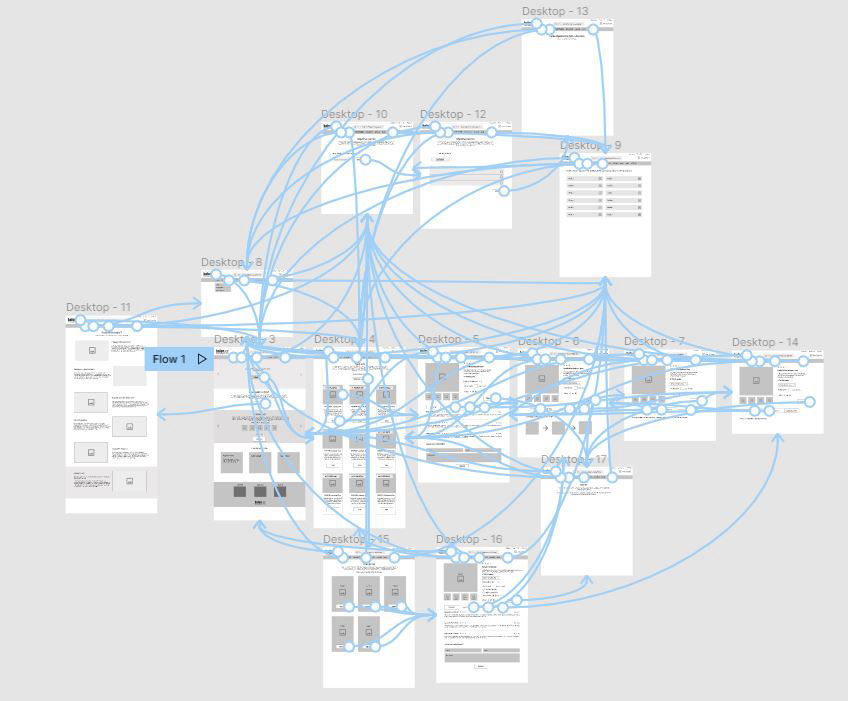
WIREFRAMING

Let's put it all together

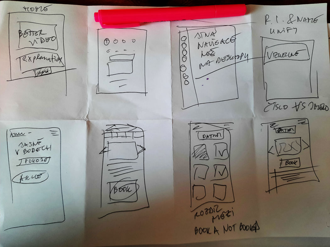
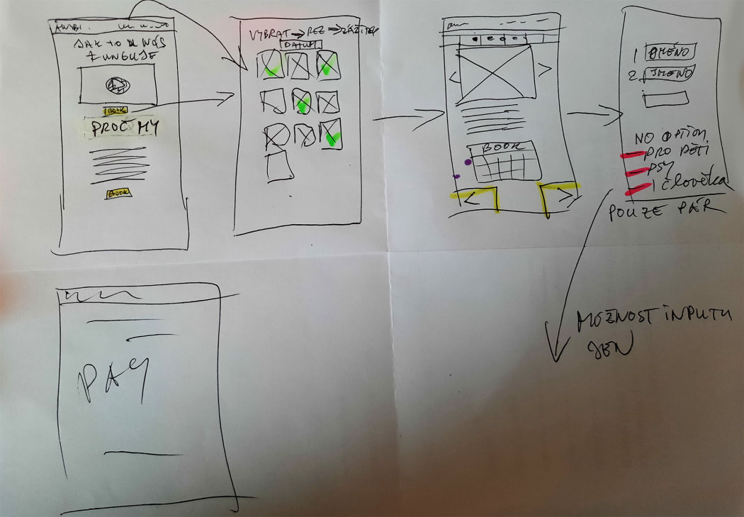
First set of interactive wireframes was then created that we tested with the end users and users with no knowledge of buying alcohol online.

After we had approximately 4 iterations (5 users per one iteration) design was ready for UI designers to start work on.

UI DESIGN

Time to give it a look

When design was ready we had 2 iterations to polish the final high fidelity prototype and all was mapped and handed to the development team.

The main aim was to modernise the way of selling this liquor so clients can make more money and to make it easier to track all online and storage transactions.

Mandlarna was already at the great start for selling their product that was by every day more in demand offline. 

The result & value

Our online solution helped spread the word (via SEO tactics) about this liquor and sales boosted sky high.

E-point map gave the other opportunity for selling throughout the whole country with a new e-point set every week.

New e-shop solution boosted online sales conversion for around 75% and helped to establish sale points all over the country for pick up in person.

Managing accounts, storage and finances was made easier via API to accountant application that was connected to the store and live time view on the web site.

General feedback from clients and its customers was amazing and everybody loved it from an easy to use perspective. Finally Mandlovice liquor could be ordered from confort of the users sofa. 

A

Grade

75 %

Conversion

A

Grade

25 %

E-points in 1 month

+ 3568

New  customers

New E-shop

Check the web site